Wednesday, 30 March 2016

Stylistic Influences

Stylistic Influences:

Whilst attempting to subvert from the themes by the original artist, we did attempt to take some influence from other artists, directors and music videos etc.
Our CD cover was created based on the idea that it had to have some form of link to the accompanying music video. This was loosely influenced by Oasis' Definitely Maybe album which contained images linking to several of their music videos, mainly seen through the way both the cover and the videos were edited visually. (Similar colour schemes and shading for desired emotional response)


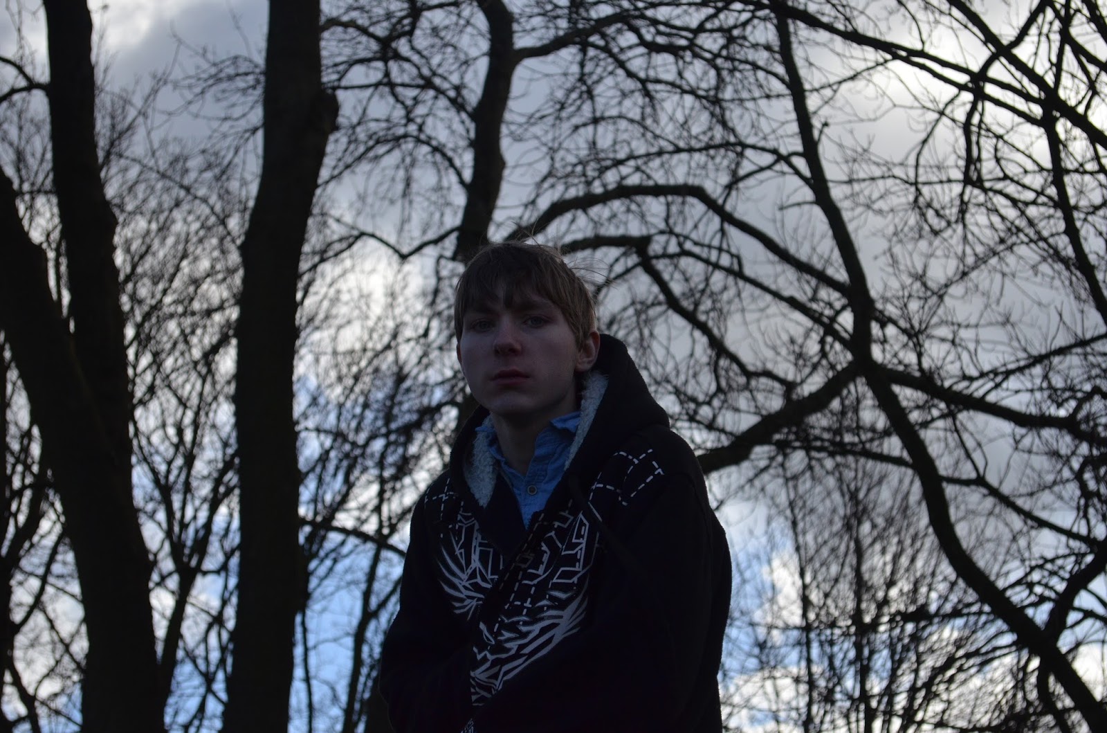
We decided to take this more literally and included an image taken directly from a clip we intend to use in our video that we took while location scouting in order to draw a clear link between this and our video when it is finished, much like Oasis did with every video from the album.

Our video itself was influenced by several different sources and we took a lot of influence from the idea of the 'Mini Movie' craze that has become far more popular in recent years. We were however cautions of the criticisms of this idea with several artists (Most notably Dave Grohl from the 'Foo Fighters') believing it to be ruining the idea of the music video. Based on this, we made our story slightly less obvious, deciding against including any dialogue or in fact a traditional narrative.

Friday, 26 February 2016

Editing the music video

The music video is very close to completion. each clip has been added to the editing software and only a few still need to be edited have effects added to them.


The task was a little more difficult and complicated than it has been in previous products with a grand total of 5 tracks having to be used to allow the clips to flow together effectively and to allow the effects to be further enhanced.


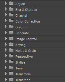
Premiere Pro features a huge variety of different effects which are available for use in our production meaning that our options in terms of enhancing pictures were almost limitless.


We have completed several drafts at different stages and uploaded them to YouTube. The video below is the latest draft and we began to ask for feedback from several sources.


The Feedback we received was as follows:


While a lot of the more constructive feedback was aimed at our acting skills, the parts aimed at various editing techniques that we either needed to add or remove was very helpful and we have already begun to act upon improving it for the final piece.

One of the more significant comments alerted us to the fact that there were an unnecessarily high number of fades used for transitioning in the edit which often confused the viewer as to what was happening. We made sure to act swiftly on this matter and removed several fades, replacing them with other means of transitioning between shots.Another criticism was that the difference in emotions between the two characters was not clear enough in the editing. We have so far addressed this by changing the lighting effects such as the saturation alongside the luma keying function in order to make the contrast between the two characters much clearer.

Saturday, 20 February 2016

Fourth and Fifth day of filming (14-15/2/16)

Our final days of filming took place on 14th-15th February in which we were able to use the entire weekend to capture the remaining shots indicated on our storyboard alongside extra shots that we thought could come in handy during post production.
Once again, the school's booking system was used in the same way.


Saturday Shoot Plan:


Sunday Shoot Plan:


Friday, 19 February 2016

Creating the CD cover

While we decided to have just one person work on the CD cover, similarly to how we made the website, we all added in our own input at various stages throughout.

After deciding on a picture from our shoot, we spoke about the various ways in which the photo could be improved and adjusted before adding in the titles. One of the key suggestions was to exaggerate the black sections of the sign as they had become faded. This meant that each individual square of black on the sign had to be coloured over (often meaning pixel by pixel).

It was also suggested that the colour gradients and contrast of the picture as a whole needed changing. Something far easier to do throughout an entire picture on Photoshop.

This change in colour was kept up throughout the entire booklet in order to establish a house style and make it appear authentic.


In order to put it all together, Adobe Illustrator was used which allowed everything to be printed in the perfect size for a CD case.