Here is the final edit of our music video for our main task:
Thursday 28 April 2016
Website
You can find our finished website here at:
http://08wellma.wix.com/madeona2website
Over the past few weeks we have been creating a website as an ancillary task to accompany the video and the CD cover.
We deci. . ded to use the webpage creator Wix to get the best possible design for our website. We chose a template which had a similar look to what we were hoping to make and began to edit.
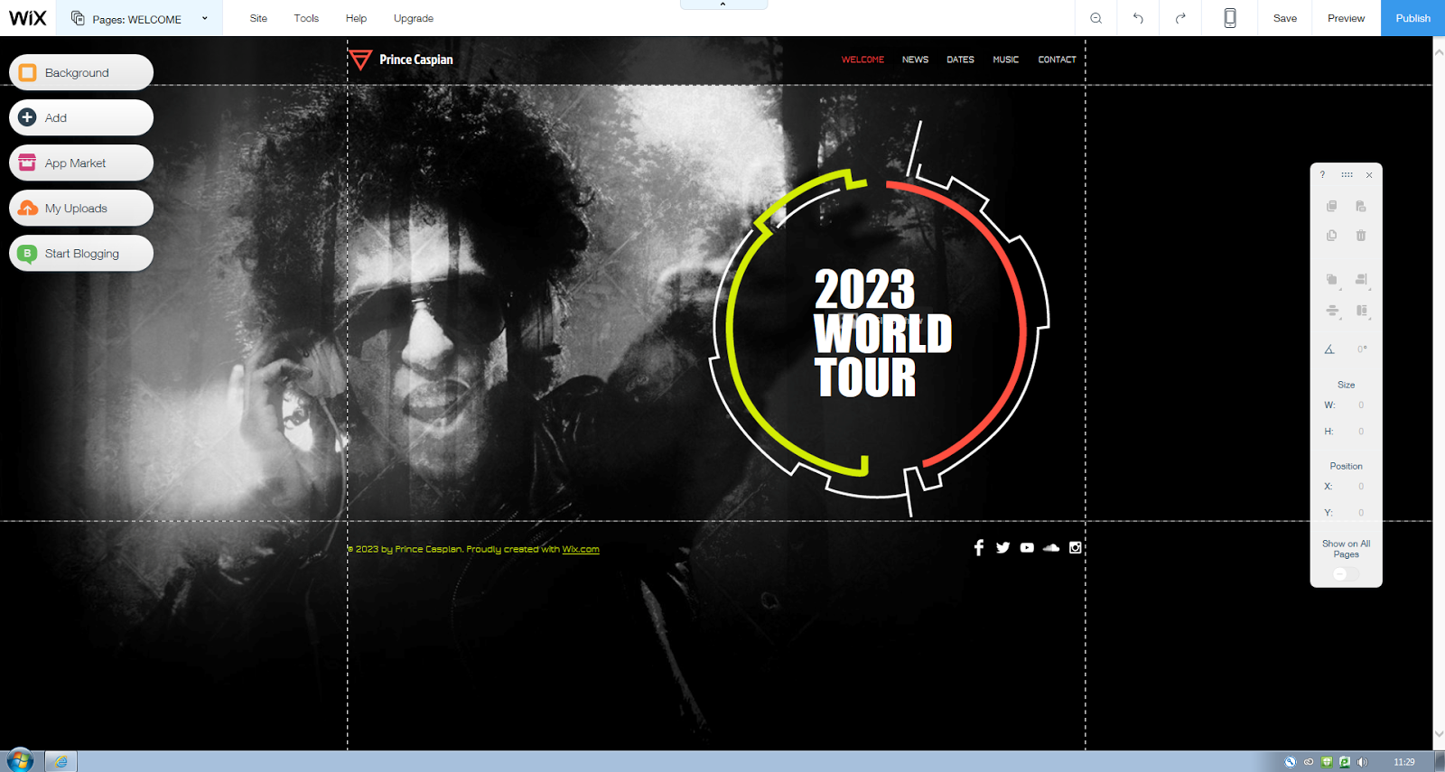
 This was the original template's home page which appeared to need a lot of work to change. Firstly, we needed to change the background to something more appropriate to our project (which would feature on all of the pages that follow) after several different backgrounds were tested, we opted for a scenic screen capture from our video which we then had to edit so that the lighting and colours allowed for text to be viewed. We also removed the large icon and text from the centre and replace it with a large title of our artist to be placed at the very top of the page. The social media links were also moved and were each linked to Madeon's official pages. The navigation buttons at the bottom were only added to this page whilst the ones at the top remained in the header on the rest of the pages.
 The News page was fairly straight forward in terms of the design. We simply split the text box which scrolled down the page into two parts in order to have everything instantly seen without the need to scroll down as this affected the size of the background picture. Once we had finished doing that, we were able to fill in the information with events including the plan for the music video and the release of the song we were covering. We also decided at this point to colour code each page, making the boxes red throughout as opposed to the flashing multi-coloured ones that were originally there.
We did a followed a near identical process for the news page, splitting the text box and adding in information about a tour including dates, location and price.


For the music page, we had to replace the music app that already existed and opted for YouTube clips with links to the same songs on iTunes. We had originally had 4 videos on the page, however due to the aspect ratio on certain computers, not all could be viewed properly.

We decided to completely scrap the bio page as it was not vital to the website and it didn't seem to blend very well with the other content.

We created our own brand new Store page which frequently features on real artists' websites selling merchandise etc. We added images of genuine Madeon merchandise and made some realistic prices to accompany them.

The header contains the Artist's title alongside the logo From the initial 'M'. This logo is also a button that links directly to the homepage.
Monday 25 April 2016
Friday 22 April 2016
Q4: How did you use media technologies in the construction and research, planning and evaluation stages?
During our research and planning stage, we used several different media technologies to present our work.
Thursday 21 April 2016
Wednesday 20 April 2016
Tuesday 19 April 2016
Q1: In what ways does your media product use, develop or challenge forms and conventions of real media products?
In order to answer this question, I have created a Gliffy:
Monday 11 April 2016
Website Colour Schemes and Mise-en-scene
Mise-en-Scene:
For our website we have decided to subvert from a lot of the conventions used by the original artist.
We will utilise screenshots from our final production piece and landscape shots taken when filming in order to make up the background, as opposed to Madeon who used a landscape artwork rather than a real picture. This background will be enhanced in order to be the middle ground between the two contrasting moods in the video. This will be the tone throughout the rest of the website.
The information will be laid out in a very simple and easy to use way through the use of tabs linking to different pages and large text boxes with information displayed in a simple list form.
The conventions of the genre and of music in general will be conveyed through the frequent use of the artists logo and brand.
Colour Scheme:
we have chosen to use several different vibrant colours for the text boxes and the text itself. This was an attempt to adhere to the conventions of the genre. This was decided through the frequent use of neon and strobe lighting seen in different music videos categorised in the same genre and is something we will pay homage to.
The background may make the text colour difficult to choose as it is likely to consist of several different colours which may blend the text in. We will attempt to counteract this by adding a translucent layer behind the text to help distinguish the text from the background.
Below is the homepage of Madeon's official website:

Character Profiles
In order to effectively convey the narrative of our music video, the characters had to be very well planned out. As we opted for a narrative which contrasted two different moods throughout, the characters had to be complete polar opposites in terms of emotion and dress sense.
Happy character:
This character is to be portrayed as the stereotypical teenager who's actions frequently suggest he hasn't a care in the world.
The emotions conveyed through actions and facial expressions will be viewed as being overall positive.
The miss en scene (especially costume) will be presented in the most positive way possible. For example, his attire will consist of bright colours and will make him appear quite smart and well put together. (The colour and lighting may also be changed during post production in order to convey this)
Sad character:
In contrast to the only other character in this production, this character subverts from the dominant stereotype and is portrayed as a much darker, more morbid person. The aim is to convey the message that unfortunate events have caused this character pain and he is try in to deal with it in whatever way possible.
Similarly, the facial expressions and mise en scene play key roles The portrayal of this character.
The costume will consist of darker and more depressing colours and will attempt to be similar clothes to that which is stereotypically worn by unsavoury characters.
Wednesday 30 March 2016
Stylistic Influences
Stylistic Influences:
Whilst attempting to subvert from the themes by the original artist, we did attempt to take some influence from other artists, directors and music videos etc.
Our CD cover was created based on the idea that it had to have some form of link to the accompanying music video. This was loosely influenced by Oasis' Definitely Maybe album which contained images linking to several of their music videos, mainly seen through the way both the cover and the videos were edited visually. (Similar colour schemes and shading for desired emotional response)

We decided to take this more literally and included an image taken directly from a clip we intend to use in our video that we took while location scouting in order to draw a clear link between this and our video when it is finished, much like Oasis did with every video from the album.

Our video itself was influenced by several different sources and we took a lot of influence from the idea of the 'Mini Movie' craze that has become far more popular in recent years. We were however cautions of the criticisms of this idea with several artists (Most notably Dave Grohl from the 'Foo Fighters') believing it to be ruining the idea of the music video. Based on this, we made our story slightly less obvious, deciding against including any dialogue or in fact a traditional narrative.
Saturday 26 March 2016
Wednesday 2 March 2016
Friday 26 February 2016
Editing the music video
The music video is very close to completion. each clip has been added to the editing software and only a few still need to be edited have effects added to them.
 The task was a little more difficult and complicated than it has been in previous products with a grand total of 5 tracks having to be used to allow the clips to flow together effectively and to allow the effects to be further enhanced.
The Feedback we received was as follows:


Premiere Pro features a huge variety of different effects which are available for use in our production meaning that our options in terms of enhancing pictures were almost limitless.
We have completed several drafts at different stages and uploaded them to YouTube. The video below is the latest draft and we began to ask for feedback from several sources.
The Feedback we received was as follows:


While a lot of the more constructive feedback was aimed at our acting skills, the parts aimed at various editing techniques that we either needed to add or remove was very helpful and we have already begun to act upon improving it for the final piece.
One of the more significant comments alerted us to the fact that there were an unnecessarily high number of fades used for transitioning in the edit which often confused the viewer as to what was happening. We made sure to act swiftly on this matter and removed several fades, replacing them with other means of transitioning between shots.Another criticism was that the difference in emotions between the two characters was not clear enough in the editing. We have so far addressed this by changing the lighting effects such as the saturation alongside the luma keying function in order to make the contrast between the two characters much clearer.

Wednesday 24 February 2016
Saturday 20 February 2016
Fourth and Fifth day of filming (14-15/2/16)
Our final days of filming took place on 14th-15th February in which we were able to use the entire weekend to capture the remaining shots indicated on our storyboard alongside extra shots that we thought could come in handy during post production.
 Once again, the school's booking system was used in the same way.


Saturday Shoot Plan:
Sunday Shoot Plan:
Friday 19 February 2016
Creating the CD cover
While we decided to have just one person work on the CD cover, similarly to how we made the website, we all added in our own input at various stages throughout.


After deciding on a picture from our shoot, we spoke about the various ways in which the photo could be improved and adjusted before adding in the titles. One of the key suggestions was to exaggerate the black sections of the sign as they had become faded. This meant that each individual square of black on the sign had to be coloured over (often meaning pixel by pixel).
It was also suggested that the colour gradients and contrast of the picture as a whole needed changing. Something far easier to do throughout an entire picture on Photoshop.

This change in colour was kept up throughout the entire booklet in order to establish a house style and make it appear authentic.
In order to put it all together, Adobe Illustrator was used which allowed everything to be printed in the perfect size for a CD case.
Thursday 11 February 2016
Risk assessment
We have filled out a risk assessment form in order to address the various hazards and dangers that we may face on set. After scouting the location for our video we were able to determine that any potential injuries were merely trivial.


Wednesday 10 February 2016
Risk Assessment
Before shooting, we filled out a risk assessment to ensure that any injury sustained whilst was accounted for. After viewing the location we were able to accurately determine the likelihood and severity of most injuries.


Friday 5 February 2016
Filming with mobile devices?
I have been toying with the idea of using a mobile device such as a phone, iPod etc. to film some scenes with in order to fully convey the modern tone of the genre through the video. I decided to practice with an old unused phone that is capable of shooting in HD. However, I was very adamant that the shots themselves had to be steady enough to look professional whilst still appearing as though no mounts have been used.
In order to test how steady the shots could be, I spent some of my own time practice by recording different angles whilst walking around both at home and at school. The problem I encountered when doing so at school was that people often walked in shot meaning that I often had to delete the videos after viewing them as I couldn't use people in my evidence without consent.
I also attempted the same with my regular phone that I use day to day. However, I was unhappy with the lower quality and the memory filled rapidly.
In the end we decided against using mobile devices to record in order to achieve a fully professional look.
Monday 1 February 2016
Third day of filming (30/1/16)
Filming resumed on Saturday 30th January where we, again intended to use the entire weekend to dedicate to filming. unfortunately due to illness the Sunday shoot had to be cancelled.
On this day we decided to lip sync the entire song in various different locations in order to fill some of the gaps in between the intro and end. this allowed us further understanding of what narrative parts had to be shot and where they had to be in terms of chronology. All we needed to record after this was the storyboarded shots for the video during the break, buildup, drop and outro of the song.
 Again, we utilised the school's online booking system in order to hire a DSLR and tripod for the weekend.

On this day we decided to lip sync the entire song in various different locations in order to fill some of the gaps in between the intro and end. this allowed us further understanding of what narrative parts had to be shot and where they had to be in terms of chronology. All we needed to record after this was the storyboarded shots for the video during the break, buildup, drop and outro of the song.


Shoot Plan
Thursday 28 January 2016
Hall's Reception theory
Halls reception theory look into ho=w the audience view the music video and how they receive the messages within. The 3 readings that an audience may have to a music video are:
- Dominant - the viewer accepts the points made in the video.
- Negotiated - the viewer partly accepts the points but may question elements of the video.
- Oppositional - the viewer totally rejects the points made in the video.
It is highly likely that the majority of the audience will have a dominant view of the video as there is very little in terms of controversy and it is mainly about how the artist feels on stage.
Few music videos of this genre raise controversial points due to already appealing to a niche audience. If so, the fan-base of the artist may possibly agree with the controversial points.
Goodwin's conventions theory
Goodwin looked into genre conventions and their stereotypical characteristics stating that there were 7 different principles:
- Links between lyrics and visuals
- Genre characteristics
- Intertextual references
- Notions of looking; similar to the Male Gaze theory
- Voyeurism; the enjoyment of watching/ looking at the artist
- Demands of the record label
- Performance, narrative or concept based music videos.
We looked into the house music genre and the music video for our song 'finale' and uncovered several different styles used in the music video in comparison to other genres. In 'Finale', there is a focus on the artist and there is a narrative of him performing at a live show. While there are shots of the artist, very few are clear; ruling out the belief that the audience watches the music video to look at the artist. While the images don't often match up to the lyrics, the line'go out young' features a camera shift onto the audience who appear to be of a young age group.
Other videos from the genre in question also use the narrative of a live performance in their videos. There may sometimes be matches between the song and the visuals, however it is often very dependent on the context of the lyrics.
Thursday 21 January 2016

Sunday 17 January 2016
Brand development
Using Glogster, we have identified the ways in which we intended to improve the designs of our brand and how we went about doing so:
Saturday 16 January 2016

Tuesday 12 January 2016
First two days of filming (9-10/1/16)
We officially began filming the music video on Saturday 9th January. We intended to use both days of the weekend to film, taking out a few hours of our day to dedicate to doing so.
We had intended to film for around two hours on both days. However, after suffering technical difficulties which could not be resolved on location, we were forced to cut the day short after just half an hour and had to film for longer on the Sunday.
During this filming period, we focused on the intro and the end of the song in order to gain clear direction as to where the main body of the video would lead. We already had a rough idea with the help of our storyboard but still had to decide on which shots would be more possible and effective in certain ares.
 Using the school's online equipment booking system we were able to hire a camera and tripod for the weekend.

We had intended to film for around two hours on both days. However, after suffering technical difficulties which could not be resolved on location, we were forced to cut the day short after just half an hour and had to film for longer on the Sunday.
During this filming period, we focused on the intro and the end of the song in order to gain clear direction as to where the main body of the video would lead. We already had a rough idea with the help of our storyboard but still had to decide on which shots would be more possible and effective in certain ares.


Saturday Shoot Plan:
Sunday Shoot Plan:
Mashd N Kutcher Website- Textual Analysis
Textual Analysis: Mashd N Kutcher Website from Max Biddlecombe
In order to get a better sense of how to create our website we have each looked at the 'Mashd N Kutcher' website in order to put together a textual analysis.
In order to get a better sense of how to create our website we have each looked at the 'Mashd N Kutcher' website in order to put together a textual analysis.
Tuesday 5 January 2016
Storyboard
After several hours total of work, we finally have a storyboard drawn up. This will be used while filming to instruct the actors and the cameramen on what and where they need to shoot.


Sunday 3 January 2016
CD Practice 2

We have done further practice with CD artwork in order to further improve our skills in Photoshop etc. This example of The Prodigy's 'The Day is my Enemy' was the inspiration for this practice.

This parody is an interesting take on the iconic CD cover and incorporates aspects found in our local area.
Subscribe to:
Posts (Atom)